up
a 135 year old dutch mattress brand launches a sub-brand
auping has crafted premium mattresses and beds in Netherlands for 130+ years. they want to be more approachable and accessible so they launched a sub-brand that they wanted to target to millennials. the brief was to create a visual and brand identity for this significantly more youthful mattress brand that still offers very high quality mattresses (as endorsed by the master brand, auping) but for someone who is adulting hard (in their 30s). tldr: the brief was: accessible+premium
[concept - branding - visual identity - illustration]
the concept: depicts the physical sensation experienced when lying down on a nice bed, comparing it to the softness and embrace of a cloud.
execution: It depicts the sensory duality of a high-quality bed (soft but firm) through visual duality (thin type and sophisticated imagery treatment versus quirkiness in graphic elements)

moodboard


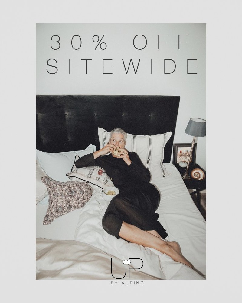
the logo balances accessible luxury - pairing a refined, minimalist typeface with a playful cloud

the logo balances accessible luxury - pairing a refined, minimalist typeface with a playful cloud